Media
Brand Guidelines
Everything you need to know about TinnCann, at a glance.

This is the hub for all brand guidelines, usages, and assets. We built this page to make it as easy as possible for you to deliver on-brand designs while respecting our brand and legal/licensing restrictions. Learn how to showcase TinnCann with the correct logos and assets.
Messaging
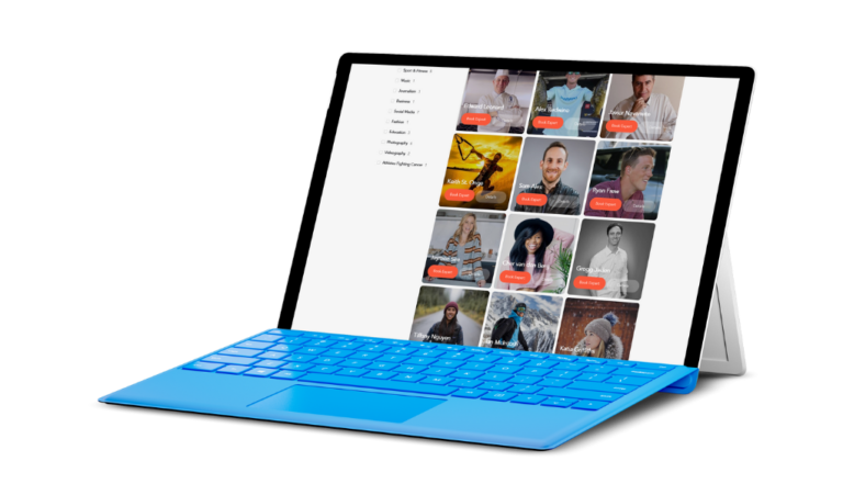
TinnCann is a curated marketplace where aspirational athletes and enthusiasts experience world-class mentorship from the Experts they admire most, through paid 1-on-1 video calls.
TinnCann is where anyone can connect with the world’s most extraordinary people.
Who do you want to talk to?
For the origin story of TinnCann go here.
Our Logos
The Logo
The TinnCann logo is the most recognizable symbol and focal point of our brand, which is why it’s so important to use the logo exactly as specified in these guidelines.
The Icon
Sometimes, we prefer to simply use the TinnCann “Icon” on its own instead of the full logo mark. In general, these are communications where the TinnCann brand has already been established—either through use of the full logo, in copy, or by voiceover.
Alternatively, there will be situations in which we will want the TinnCann brand to appear more recessive—such as on T-Shirts, other merchandise, or environmental graphics like a wall mural. In these instances, we want the graphics to be the main element, and the Icon to serve as a subtle indicator of the TinnCann brand.
Typography
Titles
Header: Montserrat Light (for web, weight 300)
Sub Heading: Montserrat Extra Bold (for web, weight 800)
Body
Open Sans Regular (for web, weight 400)
Utilize standard capitalization principles but Experts should always be capitalized.
When written, TinnCann is a combination of the two words with uppercase initial letters for both words, no space, and both with two ns.
Correct: TinnCann
Incorrect: Tinncann, tinncann, tincan, Tinn Cann, tin can
Color Palette
Primary brand colors
Sunset Orange
#F8583B
248, 88, 59
0% 63% 74% 3%
Purpose: Primary brand color.
Blackberry
#440044
68, 0, 68
0% 27% 0% 73%
Purpose: Headers, labels
Picton Blue
#3BDBF8
59, 219, 248
74% 11% 0% 3%
Purpose: Accents
Lighter 10%
#F9694F
Darker 10%
#DF4F35
Lighter 10%
#571A57
Darker 10%
#3D003D
Lighter 10%
#4FDFF9
Darker 10%
#35C5DF
Secondary colors
Dark Gray
#2F3038
47, 48, 56
4% 3% 0% 78%
Purpose: Body Text
Light Gray
#F7F7F7
247, 247, 247
0% 0% 0% 3%
Purpose: Section, page, and element backgrounds.
White
#FEFEFE
254, 254, 254
0% 0% 0% 0.4%
Purpose: Section backgrounds and text on dark backgrounds.
Success
#6BCA2C
107, 202, 44
C47 M0 Y78 K21
Warning
#FBBE28
251, 190, 40
C0 M24 Y84 K2
Error
#F84856
248, 72, 86
C0 M71 Y65 K3

